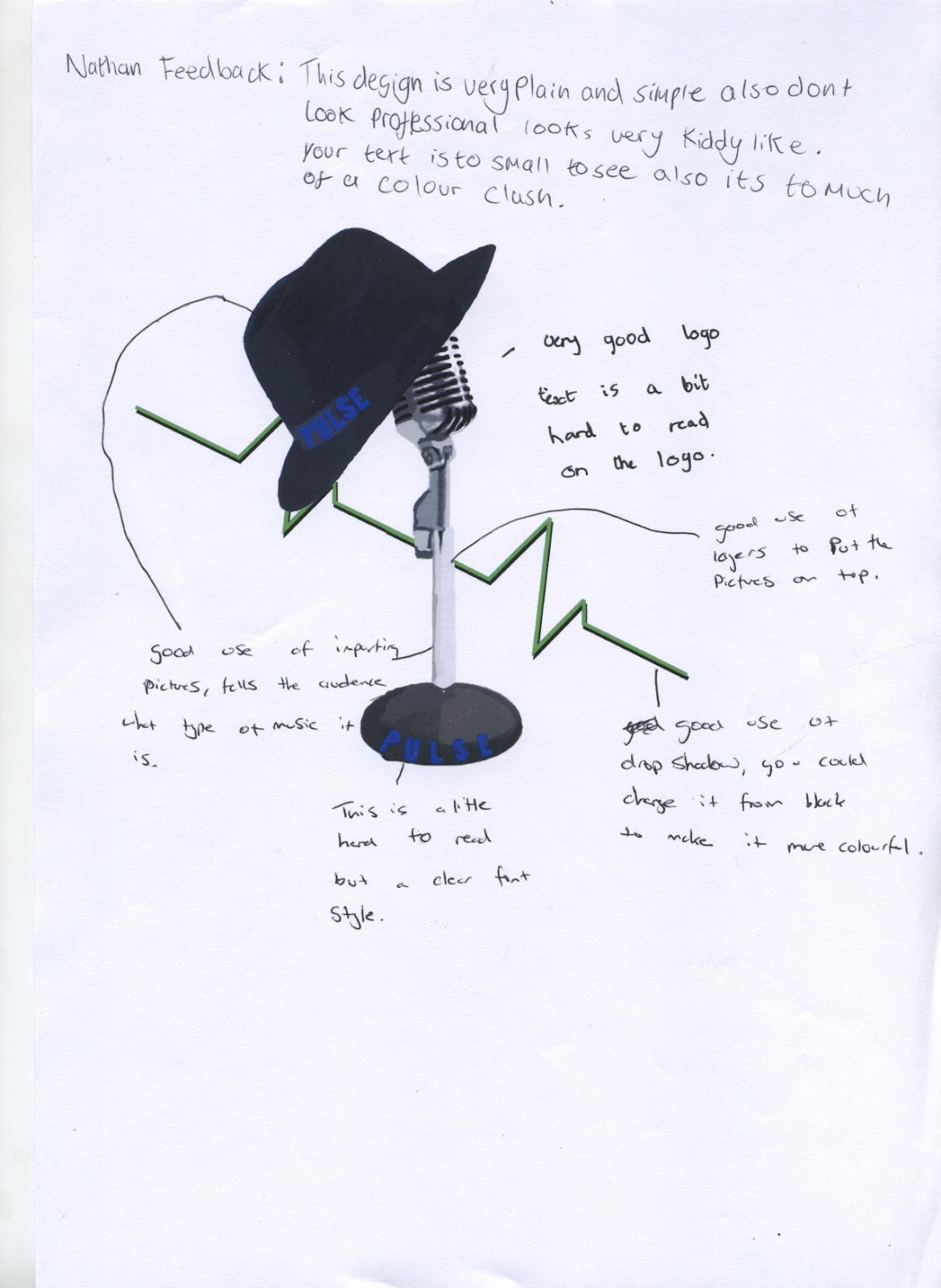
These are my final logos to this section and as you can see they all link together are easy to see and can also be changed to all sizes needed for notice boards or to letter head. This logo was at first design a speaker with a colour overlay to make it fit in with the colour scheme. However, this was change in response to the speaker becoming to boring as a square block, this was then changed to incorperate a more classic style of music as shown by the jonty angle of the trilby hat, hanging off the microphone like a hat stand. If i was to put this up on a letterhead i would use the format of .PNG because it doesn't lose any quality at any size and so the clarity of the image would be easily reconisable to those who are far away. If it was to go on a website I would save this as a .JPG because it is the smallest and easiest file to upload to the internet. If the logo was to be on a newspaper then i would save this as a .CGM as it can be opened and is the International Standard. If it was to be on a piece of merchandise i would save it as a .PDF because it is easily sent over the computer or email and also doesn't need a specific program to run it.

as seen some of them have easily noticable drop shadows and effects while others are more subtile to this degree. The green colour overlay was to make it have a more friendly and colourful feel to it. My research and feedback made me relise that the original colour and look of the shredder was dull,boring and a turn off to some people. to change this I added a colour overlay which was placed behind the guitar and shredded drums in the shredder. this i was told made a very welcoming atmosphere and the guitar and drums where made to stick out more drawing our attention to the word shred written on the guitar and the shredder.
.EPS/Vector file for use on billboards because if the logo was blown up this large as a .JPG then the image would become pixelated and the image would lose its clarity. If i was to put this up on a letterhead i would use the format of .PNG because it doesn't lose any quality at any size and so the clarity of the image would be easily reconisable to those who are far away. If it was to go on a website I would save this as a .JPG because it is the smallest and easiest file to upload to the internet. If the logo was to be on a newspaper then i would save this as a .CGM as it can be opened and is the International Standard. If it was to be on a piece of merchandise i would save it as a .PDF because it is easily sent over the computer or email and also doesn't need a specific program to run it.

This Lock logo is easily the most eye catching because mainly of its colour and the odd shaped used in its construction. I saved all of these in as a JPG. because the colours are very simple so having a limited colour palette doesnt matter and the pixelation is controlled under a stupidly oversized logo which wont be needed in the brief. This logo was the hardest to make because it had to link to the other two logos and i made an extra addition to make it link in more then one way. So I linked the colours and the use of an image by use of the key.
If i was to put this up on a letterhead i would use the format of .PNG because it doesn't lose any quality at any size and so the clarity of the image would be easily reconisable to those who are far away. If it was to go on a website I would save this as a .JPG because it is the smallest and easiest file to upload to the internet. If the logo was to be on a newspaper then i would save this as a .CGM as it can be opened and is the International Standard. If it was to be on a piece of merchandise i would save it as a .PDF because it is easily sent over the computer or email and also doesn't need a specific program to run it.