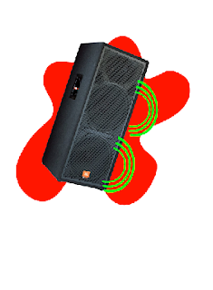
I started by adding colour in blobs to the speaker with use of the brush tool this gave me colours where i wanted but not the perfect shape that i wanted so i erased the images to make them a simple shape of the discs i wanted.
This was the first action that i created by adding a colour overlay and placing it over the speaker i did this by making a define custom shape of this and placing this over the speaker to create a shape of the same dimensions but with the colour of the final piece and then using the opacity tool made the speakers colour see through but still half opacity while I moved the image behind the colour overlay so the detail was visable behind the colour
This was the first 2 movements or changes that i made as i moved the pulse line up and changed the colours to something more appealing to an audience and was told that although this was a improvment it still was lacking that wow factor that the audience thought was possiable.
This was my original logo idea however i was told that this was to boring and not clear to which radio station it belonged to so I then started to play with the colours and the location of the additions. The sound waves I have placed next to the speakers was painted and then cut into a new layer I then linked it into the same layer so that I could move them all at once.
So with this i changed colours still and then started to create variations upon this until I watched some of the music videos i thought would be played on this radio station. And saw a theme or routine in almost all the videos.
This was the base of the logo and would only change slightly and this was taken from a camera that i went and took from the a music room in sutton. I however had to erase the background so i lowered the tolerance of the magic wand tool and clicked on the background and it selected anything that wasnt the image and then i could erase the background.
To make the coloured background i changed the selected colour of a custom shape and then placed it behind the speaker I enlarged the image to make the custom shape disappear halfway behind the speaker this makes the image seem more interesting.
I thought that the speaker needed to see as if it was playing music so i added 3 sound waves to make it seem as though it was playing music.
I thought that the speaker needed to see as if it was playing music so i added 3 sound waves to make it seem as though it was playing music.
This is the logos last form and is as seen is quite eye catching. and this was done by adding two made sound waves added and clipped them together to the logo to make all the colours seem different and the image seem more interesting.
I then acted on this making an entirely different logo starting with two pictures of a trilby hat and a old block microphone these always seemed to come up in the videos that i had seen. This suggested either a dance or a more classical theme on this channel.
Then i noticed that the stand for the microphone although all was pixelated was to short and so used the cut and layer copy tools to make it longer by first cutting off the base of the microphone stand and then cut a section of stand off with the magnetic lasso tool. then by layer copying this i made 3 more sections
that then i placed in position and then linked them all together as one entire piece to use. And then reattached the base of it.
Then i was told good and bad parts of this logo and acted on this by adding the heartbeat pulse line and started experimenting with multiple colour ideas starting with blue then finishing by mixing green and the same shape slightly off scu with the other in black
I then started to think and rethink about the placement of the objects such as the hat and the pulse line the pulse line i started by putting at an angle crossing through the hat and microphone to make it seem more complicated. and therefore appeal to more people by making it more eye catching.
Then i was warned that the microphone was to easily reconised that it was to pixelated which i consided and then stared to find a way of making it more eye catching without it becoming pixelated i initially started to do this through the use of opacity as shown below but relized this didnt work if it was already pixelated.
Abandoned idea!!! where created a custom shape with the pen tool and created an overlay. This was then going to become a overlay to change the colour of the microphone to get rid of some of the pixelation however when i was putting the overlay on it the pixelation was still there this was because the magnetic lasso didnt create a smooth edge but followed the pixels around the shape. So I removed this and redesigned the solution as described below.
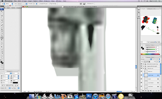
Then i noticed that i could smudge the edges with the smudge tool and tried this but still had a slight pixelated feel to it and it needed to be more easily contrastable to work so i used the eyedropper tool to get an exact colour and then started to paint over it until the colour mismatched the background and then did this again and again until it was entirely covered like this.
This was the finished effect on the microhones head the above screen capture was the smudged version of the stand area in the middle.
I was then told again that the microhone looked great but now the hat in comparison was to noticably different and to do the same effect to this also. by first eyedropping the colour then brush tooling the area with that colour.
this was the original finished result for this work on the pulse logo.
I then started to work on the shredder logo and started by using a pictures that was what first came into my head on designing it which was unsuprisingly a shredder but one that i had cut the front off by using the lasso tool and changing the opacity.
the effect i wanted was to see the edges on the back of the shredder so to compensate for not being able to see this i added in 3 lines that when combined looked like the 3d box inside so i then set to work on the instruments.
I started with a guitar using a blue background to see where the cuts in the picture were and this made it easier to cut and remove in relativly less time then it would take to find all the different pieces and put them together seperatly once all were cut and on different layers i moved them into position and then linked all the layers to move them all as a single piece of layer.
I also cut the guitar head to stick out of the top of the shredder this made the logo more intresting then the original design.
I then moved sections individually to make it seem as though it was moving through the shredder without any animation by moving them as if they have fallen from the blades.
The base of the shredder then looked boring and also bland so i started to move drums and cut them up in the same way i did with the guitar by lasso ing the section and creating a layer via cut to make lots of new layers then the drum could be moved individually and placed exactly where i wanted them at the base of the shredder. I noticed that the pieces where placed some were to large so i used the eraser tool to remove these areas.
This was the first peer feedback which i got given although i didnt totally agree with it I had some agreements such as the shredder logo looking bland and boring with no colours although they werent completely finished when this was done so the writting and the colours were all made to match so if one didnt have a link it had a backup like link.
same but so you can see the pulse logo top right
Finished lock logo
The lock logo was made to seem like you had a important access or VIP to an area this was done by the clever shapes and the golden key through the lock.
I initally moved the key key from here to where only half of it was seen as though it was inside the lock but was told this would look shoddy and boring.
I added effects such as drop shadow and inner glow to create the feeling as though it was moulded with the name inside the lock metal. and using this did the same for all logos as seen below.
Lock logo text imbedded into the entire base of the microphone.
General view.
General view
General view of all the logo linked and next to each other to make it easier to identify the logos link.
Logos link easily linked look


